
As a person who has worked with spatial aesthetics for many years, I perfectly understand how difficult it sometimes is to move away from familiar, “safe” palettes. Beige, grey, white – these are classics that will never fail. But don’t you feel that your home deserves more? Are you ready for experiments that will make your guests gasp in admiration? I am sure that these five color combinations, which personally delight me, will become a real inspiration for you. They prove that design is about boldness and the ability to see beauty where others only see contradictions, reports MODISTA.
Of course, the key to success here is the correct selection of shades. Even the most extravagant palette will shine with new colors if the right undertones are chosen. Let’s analyze in detail these unique combinations that you can easily recreate in your home.
Terracotta and Emerald: An Exotic Balance of Passion and Calm
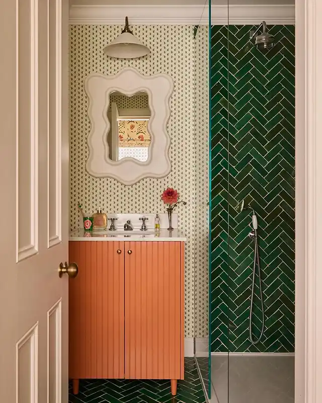
This is probably one of the most interesting and noble combinations we can find in modern interiors. I was pleasantly surprised by how organically and holistically these two completely different-in-temperature colors complement each other.
Terracotta, with its warm, earthy base, brings coziness and a sense of stability. Emerald, deep, rich, and slightly cool, adds luxury and visual freshness to the interior, as if you are plunging into a tropical oasis. To prevent the overall picture from becoming too “heavy” or dramatic, I advise using a neutral background. For example, creamy walls with a light, subtle green ornament will help balance this palette. This is an ideal solution for a small bathroom or an accent wall in the living room, which looks both non-trivial and not too obvious.
Grey-Blue with Warm Red: Reimagining the Classics
Who still believes in the myth that red does not “rhyme” with blue? This example completely debunks such an outdated rule! The secret lies in choosing the right undertone: you need to find the ideal balance between saturation and warmth.
Підписуйтесь, щоб не пропустити нічого цікавого! | Follow us so you don't miss anything interesting! | Subskrybuj, aby nie przegapić niczego ciekawego!
In this combination, the grey-blue shade plays the role of the background, creating a feeling of air and coolness. In contrast, red acts as a dynamic, energetic accent. But attention: to avoid harshness, choose only warm variations of red – brick, poppy, or one closer to orange. This choice gives the palette depth and sophistication, transforming the room into an elegant and balanced space.
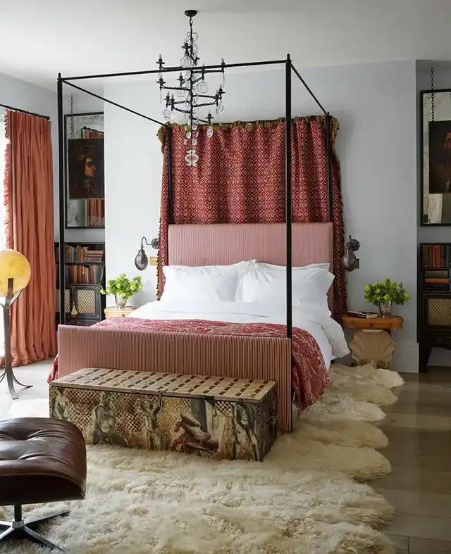
Deep Blue in Tandem with Brick: The Play of Contrasts
Here we see a somewhat similar situation, but the color roles are swapped. Brick (a shade with a lot of orange in its composition) becomes more of a background solution – for example, the color of the walls or large surfaces. But deep blue, associated with sea depths or the night sky, draws all the attention to itself, concentrating the gaze on the furniture or decor items.
The main advantage of this duet lies in the interaction of complementary colors. Since orange is a direct complement (complementary color) to blue, it visually enhances its saturation but does not allow it to become too cold. Brick seems to “offset” the blue, creating an incredible visual effect that is simultaneously bold yet absolutely harmonious.
Cozy Trio: Terracotta, Cream, and Brown
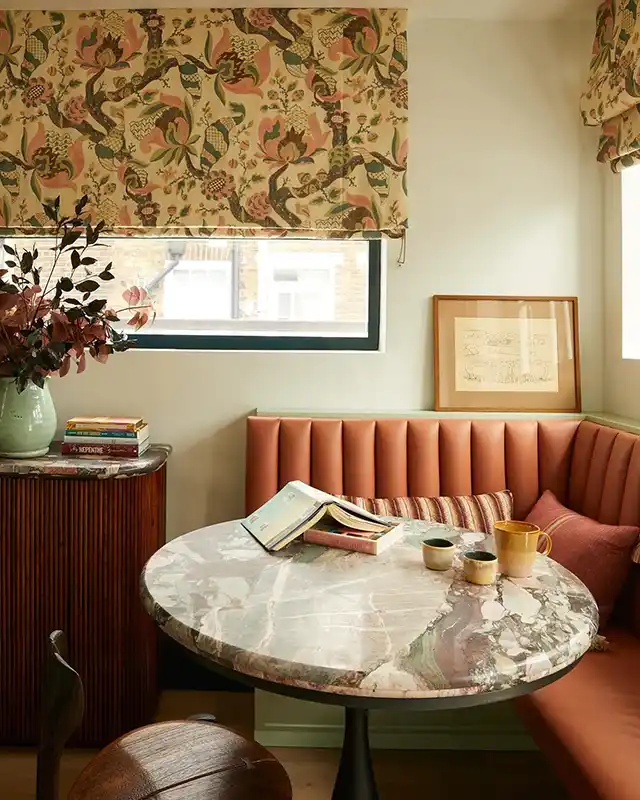
Designers often use complex, multifaceted shades to create not just color, but a true atmosphere. In this trio, a special, sophisticated cream undertone takes center stage. It does not seem overly warm, yet it perfectly resonates with terracotta, creating a soft and enveloping feeling.
Brown, presented in the form of an elegant wooden console or floor, brings structure and classical depth. The bright accent here is the marble countertop, which seems to adjust to the shade of the walls, creating an effect of monolithicity and expensiveness. This is the ideal palette for those who seek to create an interior filled with calmness, natural shades, and a sense of reliability.
Explosive Combination: Yellow, Pink, and Red
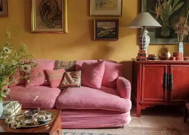
This is truly a complex palette to implement, requiring filigree precision in the selection of shades, as the slightest mistake can make the result too chaotic or, conversely, tasteless.
Firstly, note: yellow here is used not in its shouting version, but in a more muted, calmer version. The brick-red nightstand performs an important function – it visually “grounds” and calms the brightness of the yellow. And pink, although chosen in a rather romantic, soft tone, looks extremely sophisticated in this environment. It does not seem too “doll-like” or playful, but adds lightness and a playful note to the palette. Such a trio is a challenge to stereotypes, which, if implemented correctly, will give your space a unique, sunny, and cheerful energy.
As we see, for your interior to shine with new colors, it is not necessary to use only familiar and safe solutions. The main thing is not to be afraid to experiment with colors that at first glance seem incompatible, and to remember the importance of correct undertones. Bold color duos and trios, where dark shades are balanced by light ones, and warm ones by cool ones, create depth and character. I am confident that by choosing any of these combinations, you will add not only aesthetic appeal but also genuine, unique individuality to your home.